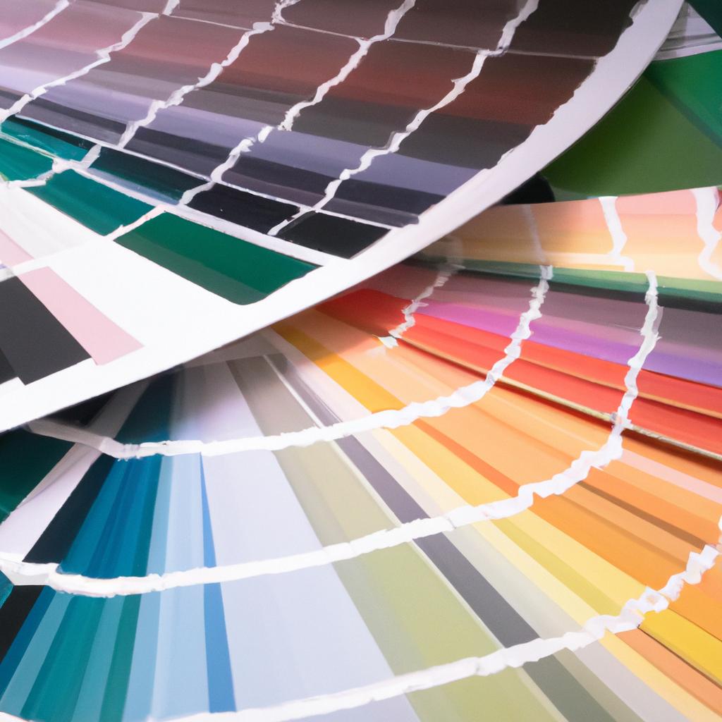
Introduction: What is a Color Scheme and Why is it important for Home Decor?
A color scheme is an arrangement of different colors that is used to decorate a room or your entire home. The choice of colors and the way they are combined can affect both the way a space looks, as well as how you feel when you’re in it. With the right color scheme, you can turn a dull and dreary room into one that is vibrant and full of life.
Color has the ability to evoke certain feelings and create atmosphere. Warmer colors like reds and yellows can make a room feel more energetic and inviting, while cooler tones like blues and greens evoke a sense of calmness and tranquility. Depending on the type of atmosphere you want to create in your home, you can choose the appropriate color scheme.
In addition to the psychological effects of color, your color scheme will also set the tone for your home’s overall design aesthetic. A home with bold, vibrant colors will have a much different look than one with muted neutrals. The colors you choose will also tie in with the furniture, fixtures, and accessories in your home and can help make the space feel cohesive and well-put-together.
Choosing the right color scheme for your home can be a daunting task, but with the right considerations and knowledge, it can be both inspiring and enjoyable. This guide will explore all the essential elements you need to consider when selecting your color scheme, and provide tips and ideas for creating a harmonious and visually appealing space.
Considerations When Choosing a Color Scheme
Choosing the right color scheme for your home is an important consideration. It’s not just about colors that you like; the choice of colors needs to incorporate other factors such as lifestyle, personal tastes, interior space, lighting, environmental context, and furniture and accessories. Together, these considerations can help create a harmonious decor for your home.
Lifestyle:
The first consideration when choosing a color scheme for your home is your lifestyle. Are you an energetic, active person who loves lots of vibrant colors, or do you prefer a more relaxed atmosphere with muted tones? The colors you choose should reflect how you want to live in the space.
Personal Tastes:
Your personal tastes should also be taken into consideration. What colors do you naturally gravitate towards? If you prefer dark blues and purples, then those should be incorporated into your color scheme. Conversely, if you prefer bright pinks and yellows, then those should also be present in your palette.
Interior Space:
The size and shape of your interior space is something to consider as well. If you have a small room, then lighter colors will make the space appear bigger. Darker colors can work in larger rooms, but if you want the space to look bigger, then opt for lighter shades.
Lighting:
Lighting is also an important factor in your color scheme. Light colors often work best in brightly lit spaces, whereas darker colors might look better in dimmer areas. Be sure to take the natural and artificial lighting of your space into account when choosing your colors.
Environmental Context:
Your color scheme should also be tailored to your environment. If you’re close to nature, consider earthy tones to bring the outdoors inside. If you live in an urban area, brighter colors like yellow and orange might be the way to go. Think about the context of your space and how that informs your choice of colors.
Furniture and Accessories:
Finally, consider the furniture and accessories that you already own. Do they provide any inspiration for your color scheme? It may be wise to choose a few colors that exist in your existing décor so that everything looks coordinated and in harmony.
All About Color Meanings: Explore the Psychological Effects of Colors
Colors are powerful tools when decorating your home, as they can have an effect on how we feel and act. Warmer colors, like red, orange and yellow, are associated with energy, excitement, and passion. Cooler colors like blues, purples, and greens evoke feelings of serenity, calm, and peace. Knowing how colors make you feel can be a great asset when deciding which palette to use in your home.
Colors can also influence our moods, whether we realize it or not. For instance, blues are known to create a feeling of relaxation, while red is associated with alertness. Likewise, blacks are often used to evoke mystery and thriller vibes, while whites can be used to create a sense of freshness and cleanliness. It’s important to consider how each color might affect the energy of the room when deciding which colors to choose for your home.
The psychology of color can also help you develop a more harmonious atmosphere. Warmer tones tend to draw people together, while cooler tones can help give a feeling of space. Additionally, bolder colors can help to energize a space, while softer shades can help bring a more peaceful ambiance. By considering these concepts when deciding on a color palette for your home, you can create a beautiful and tranquil atmosphere for yourself and any visitors.
Combining Different Colors and Tones
Creating a harmonious color scheme for your home doesn’t mean having to stick with a single hue. In fact, mixing different colors and tones can bring some very interesting results. By understanding what colors work well together and which techniques to apply, you can create the perfect atmosphere for every room in your house.
A great way to unify a room with multiple colors is to look for colors that have similar undertones. This helps tie your palette together without having to worry about overwhelming the eye. For example, if you want to pair a bold red with a pastel pink, try looking for a pink with red undertones. Likewise, if you are looking to combine a light yellow with a deep blue, find a blue hue with hints of yellow. With this technique, you can create stunning color combinations without having to worry about clashing colors.
Another great way to use multiple colors is to consider the concept of warm and cool colors in design. Warm colors include red, orange, and yellow, while cool colors include green, blue, and purple. When it comes to combining warm and cool hues, make sure to keep the scale balanced. If you choose to decorate with an intense shade of red, try to soften things up with a pale or muted blue. Doing this creates a peaceful contrast of tones and ensures that neither color takes over the room.
Finally, don’t forget to consider the shades and tints of your chosen colors. Picking out several shades of the same color can create a subtle sense of harmony, as the lighter and darker shades will always work in harmony with each other. Whereas multiple colors can sometimes be too bold and bright for a relaxing ambience, using various shades of the same color can add depth and texture to a room without being too distracting.
Monochromatic Schemes
When it comes to decorating your home, one of the simplest and most effective color palettes you can use is a monochromatic scheme. By sticking with one color, or close variations of the same hue, you can create a unified and cohesive look without compromising the style of your home.
A monochromatic color scheme works well in nearly any space, from kitchens and bathrooms to bedrooms and living rooms. The single hue creates natural continuity between spaces, making it the perfect pick when an open plan layout is involved. It’s also a great way to keep a room looking classic and timeless.
Monochromatic schemes don’t have to be limited to one color, though. Shades, tints, and tones of the same hue can be used to give the room dimension and depth. You can choose to have an all-over neutral base with just a soft range of color variations, or go bold by having a vivid primary shade on the walls but layering in darker shades for furniture and accents.
These subtle variations achieve two goals. First, they allow you to easily define areas and help your guests know where one space ends and another begins. Secondly, introducing several different shades within the same color family provides visual interest despite the monochromatic palette.
Analogous Schemes: Relaxing and Comfortable Atmosphere
An analogous color scheme is one of the most popular for creating a calming, inviting environment. These schemes use colors which are adjacent or near to each other on the color wheel. For example, a navy blue and a light blue – or pink and orange.
Using this type of color scheme can give your room an effortless look, creating a harmony and balance that’s easy on the eyes. As the colors are already similar, it requires less coordination and thought to choose a combination that works, making it ideal for those who just want a simple effect.
However, be aware that using only analogous colors can make the room feel a bit too uniform and bland. To prevent this, mix in a few other colors to break up the monotony. Use a deep, contrasting shade to provide some depth and interest – such as a muted green for a navy and light blue scheme.
The warmer end of the analogous spectrum can be a great starting point for an inviting, warm atmosphere. Try pairing softer, lighter hues like cream, pinks or yellows. This creates a lovely, gentle overall effect that feels airy and relaxed.
If you prefer something a bit bolder, choose analogous colors from the cooler end of the spectrum -such as blues, greens and purples. This gives off a more modern, contemporary feeling. Mix shades with different levels of saturation and different tones – including accents of black and white – to add more character and energy.
Complementary Schemes: Exploring the Benefits of Using Opposite Colors
When it comes to color schemes, one of the most striking looks you can achieve is by mixing opposite colors. This color scheme is known as complimentary colors. It consists of two hues that sit directly across from each other on the color wheel, such as blue and orange, yellow and purple, or red and green. Complementary colors when used together, will create a high visual contrast. This makes them ideal for accent walls or to draw attention to certain pieces of furniture.
One of the benefits of using complementary colors is that they can help create a sense of balance in the room. For example, if one color is used more prominently, the other can be used to subtly emphasize the main hue. This type of color combination also helps to make a space feel more expansive, as the high contrast between colors helps create an optical illusion of boldness, making the room look larger than it really is.
When working with complementary colors, it’s important to remember to choose shades that are close in value. By doing this, you can avoid creating too much contrast. Additionally, a great way to incorporate complementary colors is to use lighter and darker tones of the same hue. This will create a pleasing aesthetic without being too overwhelming.
Exploring Trends in Home Decor
When it comes to decorating your home, looking at a few popular trends can help you get creative and find the perfect color scheme that fits you. Look around social media, search for ideas online, or ask friends and family to get an idea of what colors are in style today.
In 2019, monochromatic colors were popular in all shades of white and cream. People used one color with various tones to create a minimalistic and modern look in their homes. A lot of blue was also trending especially in shades of navy and sky blue. Shades of pink were also popular, especially in pastel hues with a touch of blush. Yellow and green were popular choices for a cheerful and vibrant look.
This year, colors inspired by nature like earthy greens, sandy hues, and pale blues have been seen all over social media. Living coral was Pantone’s Color of the Year for 2019, and this energizing hue has made its way into many homes. Meanwhile, muted colors like sage and rose will be popular for 2020.
You can use these trends as inspiration for your own color scheme. Think about how you can use them in combination or even twist them to make something unique. Popular colors, combined with your own personal style and tastes, can create a beautiful and harmonious look that you’ll love.
Tips For Experimenting With Color
It can be daunting to experiment with color, but pushing your comfort levels when it comes to home decor is always a rewarding experience. On the other hand, if you don’t take enough risks with color, you’ll never create the unique look that you’ve envisioned. Here are a few tips to help you take the necessary risks and make smart choices when experimenting with color:
- Consider using a color wheel to work out the best combinations. You can use this as a guide to identify the exact colors that will work together.
- Test out colors by starting with smaller areas such as accent walls. This way, you don’t have to commit to large areas until you’re sure you like the colors.
- Think about how the color will look at different times during the day. Natural light will affect the overall color of the room and its impact.
- Incorporate texture into the design. This will help to break up the colors of the room and create visual interest.
- Think about your furniture and accessories. If the furniture is a statement, choose colors that will complement it.
- Don’t be afraid to use accent colors. They will help to bring personality to your design.
Experimenting with color can be fun and exciting, but it is important to remember that you have to be patient when making changes. Take your time to think and plan out the space, this will give you the best chance of achieving a look that you’re happy with.
Strategic Use of Color in Your Home
Your home should not only be a place for comfort and relaxation, but also reflect an expression of your personality and style. Strategic use of color is key in creating the perfect balance between beauty and functionality. Here are some tips for using color to enhance your space.
Using Color to Set the Mood
Color can be used to evoke different moods and emotions. Warmer colors such as red, orange, and yellow are often associated with passion, energy, and vibrancy. Cooler colors like blues and greens tend to be more calming and soothing. Choose a color scheme that best reflects the type of mood you want to create in your home.
Using Color to Balance a Room
Color can also be used to balance a room by contrasting or unifying the elements within it. For example, you can use bold colors to draw attention to specific areas or use using dark colors to subtly ground the space. You can also use a light color to open up a room and make it appear larger, or use bright colors to add visual interest.
Playing With Texture and Shades
Not only can you use varying shades of one color to create interesting combinations, but you can also experiment with combining different textures to make the colors pop. Introducing textured surfaces such as fabrics, rugs, and walls can all enhance the colors you’ve chosen. Have fun and play around with various textures and shades until you find something that works for you.
Final Touches and Finishing Pops of Color
Finally, don’t forget to bring texture and depth to your home with small details and pops of accent colors. You can do this through small accessories such as pillows, artwork, and vases, or even through unexpected features like throw blankets and bookshelves. These minor touches can add life to your rooms and can make a huge difference in the overall ambiance.
Final Touches and Finishing Pops of Color
The right color scheme can bring life and personality to a home. Adding some pops of accent colors to the room is a great way to enhance its overall atmosphere and create an unique sense of style and comfort. Here are some tips to help you effectively use small details to complete your room and make it stand out:
- Introduce pops of color with pillows, throws, rugs, and other textiles.
- Choose an accent wall to draw attention to a specific area of the room.
- Bring in plants and flowers as living pops of color.
- Play with different textures and materials to create contrast and add richness.
- Highlight artworks, photographs, or special objects with lighting.
- Use a pop of color in kitchen backsplashes or countertops.
- Change up wall decorations regularly for a new look.
When you take your time to pick out small elements and carefully craft a space that truly reflects your style and personality, you will be rewarded with a harmonious and comfortable home. With thoughtful final touches and pops of color, you will truly love your home.
Conclusion: Choosing the Right Color Scheme for Your Home
Choosing the right color scheme for your home is an important part of the interior decorating process. Different colors evoke different emotions, so it is important to understand the psychology of color and how to use it to create the atmosphere you want in each room of your house. Considerations such as lifestyle, personal tastes, interior space, lighting, environmental context, and furniture and accessories should all be taken into account.
Combining different colors and tones can give your home unity and harmony, while choosing a monochromatic scheme will make your interior look more unified. Analogous and complementary schemes are also popular ways to combine shades of colors for a balanced and aesthetically pleasing effect. It is also possible to experiment with trends in home decor and create unique looks by taking risks and using color strategically to enhance and balance your room with final touches of accent colors.
By following the tips outlined in this guide, you can easily choose a color scheme that works best for your home. With creativity and thoughtful consideration, you can create a beautiful and harmonious space that reflects your own personal style.
comments: 0
