Introduction – Color Psychology in Interior Design
Have you ever walked into a room and felt relaxed, energized, or comforted? That’s because the colors used in the space have the power to influence our moods and emotions. Color psychology is the science and study of how color affects our emotional and psychological state. Through understanding color psychology, one can use color to create the perfect atmosphere and mood in interior design.
By combining the principles of color psychology with an understanding of different interior design styles, we can harness the power of color to achieve amazing results. Through this guide, will learn about color psychology and color schemes, how to apply them to interior design, and how to select the right colors for your project.
Defining and Explaining Color Psychology
Color psychology is the study and influence of colors on our emotion and behavior. It takes into account the way we perceive, respond to and interact with colors in our environment. Color psychology explores how different colors affect us psychologically, as well as how we use color to convey messages, feelings, set moods, and evoke reactions.
The way humans respond to color is highly subjective and can be influenced by a number of factors, such as personal preference, cultural background, age, gender, or even time of day. The same color can evoke different emotions or reactions in different individuals.
The science of color psychology looks at the effect of specific hues, shades, tones, and tints on human emotions and behavior. It’s said that certain colors can increase or decrease appetite, alertness, creativity, and more. Colors can be used to evoke certain moods or feelings, such as excitement, relaxation, happiness, sophistication, romance, and more.
Definition and Discussion of Color Schemes
When discussing color schemes, it’s important to understand what a color scheme is and the different types of color schemes that are available for use. A color scheme is a combination of colors used in a single space, whether it is an interior design project or a piece of art. The color scheme can be used to define the atmosphere and mood of the space, as well as the emotions of the people that occupy the space.
There are various types of color schemes that can be used in interior designs, such as monochromatic, analogous, complimentary, split-complimentary, triadic, tetradic, and more. Each of these color schemes has its own parameters and principles that must be followed in order for them to be successful.
For example, the monochromatic color scheme consists of only one color, but the shades and tints of that color can be used to create a specific atmosphere. Meanwhile, a complimentary color scheme uses two colors that are opposite each other on the color wheel, creating contrast and visual interest.
The various color schemes can also be combined to create unique effects, such as the combination of a complementary color scheme with a triadic color scheme, which results in a harmonious and pleasing atmosphere.
How Color Psychology Applies to Different Interior Design Styles
Color psychology can be used to create different atmospheres in different interior design styles. Depending on the style, there will be certain colors that work better than others. It is important to consider all elements of the space when it comes to choosing a color scheme.
A minimalist style, for example, works best with a limited palette of monochromatic or neutral colors. These subtle tones help to create a sense of balance and serenity. On the other hand, bolder colors are suitable for more eclectic spaces as they will bring an energy to the room. Vibrant colors like red, orange, and yellow can be used to create a lively atmosphere.
When it comes to antique or traditional styles, natural hues such as cream, brown, green, and blue tend to work well. These colors help to keep the feeling of the room warm and inviting. Meanwhile, modern styles often suit brighter, bolder colors like emerald green, cobalt blue, or magenta. These colors bring a contemporary feel to the space.
It is important to take into account how the colors interact together in order to create the desired atmosphere. Certain color combinations can evoke distinct emotions and it is important to choose the right colors to create the desired mood.
Specific Interactions between Colors and Atmospheres they Create
Certain colors evoke specific emotions and atmospheres. For example, warm colors like yellows, oranges, and reds can create an inviting and cozy atmosphere, while cool colors like blues, purples, and greens can set a calming and tranquil tone. Different intensities of colors, such as pastels or bright shades, can affect the atmosphere created too. Bright shades of a color create more energy and excitement, while pastel shades are more subtle and can create a more relaxed atmosphere.
The way you combine colors will also affect the atmosphere created. In general, it is best to create a balanced color scheme that uses both warm and cool colors. This can help to create a balanced atmosphere and prevent one color from becoming overwhelming. For example, a living room with mainly cool colors may become too subdued, but adding some warm colors as accents can help to break up the space and add some energy to the atmosphere.
Discovering Your Personal Color Favorites
It can be difficult to decide on the perfect colors for your interior design projects. Luckily, with color psychology you can find the shades that will bring out the best atmosphere and mood for your space. The key to unlocking the perfect color scheme for any project is to consider which colors you personally prefer.
When it comes to selecting colors, there is no right or wrong answer. Everyone’s preferences are different, and taking the time to reflect on which hues make you feel the most comfortable and relaxed is a great way to start. It could be warm tones like yellows and oranges that make you feel energized and motivated, or perhaps cool shades such as blues and greens that make you feel more calm and relaxed.
Don’t be afraid to take risks when creating your personal favorite color palette. Consider combining complementary colors from different parts of the color wheel and experimenting with different tones, tints, and shades. By playing around with different colors, you can create an atmosphere that is completely unique to you and your home.
Guidelines for Combining Colors to Create Moods
Creating the right atmosphere in a space isn’t just about finding the perfect color; it’s also about combining those colors in a way that highlights and accentuates their properties. This is when color psychology comes into play: it can help you understand how various colors interact with one another, and what atmosphere they create when put together.
Here are some tips for selecting complementary colors and combinations that will bring out the best in each hue:
- Start by selecting a single “key” color – this can be the dominant color or a secondary shade which will play a major role in the color scheme.
- Think of the “opposite” color on the color wheel – this color will be used as an accent and can help add visual interest and brighten up the room.
- Choose several different shades and tones of the same palette – this will add depth and create a more visually appealing environment.
- Opt for neutral shades – these colors can be used to soften the overall effect, as well as create a more calming atmosphere.
You can also look at examples of successful color combinations and use them as inspiration for your own projects. By understanding which colors work together and how to combine them effectively, you can create the ideal atmosphere for any interior design style.
Enhancing the Mood with Lighting and Accessories
When creating an atmosphere with color psychology, lighting can play a crucial role in either enhancing or detracting from it. Choosing the right lighting can make all the difference in how a space looks and feels. The type of bulbs and fixtures you use will also affect the overall atmosphere. For a calming, soothing atmosphere, use warm, diffused lighting; for an energizing atmosphere, use bright and direct light.
Accessories are another great way to enhance the mood of the space. A luxurious tapestry draped on a wall with a vibrant hue can draw attention and add warmth to the room. Other accessories such as throw pillows, rugs, and art pieces can be used to add texture and depth to the space and further enhance the atmosphere created by the color scheme.
Exercises to Help Select Colors for Interior Design Projects
Choosing the right colors for your interior design project can be a daunting task. Using color psychology in interior design can help you to create an atmosphere and mood specifically tailored to your needs and preferences. To select the right colors, you can use a few exercises that will help you focus on the color choices you make.
One such exercise is to create a color wheel. A color wheel is a visual representation of all of the colors available. This allows you to see how different hues, shades, and tints can work together to create the perfect atmosphere. And this type of exercise can also help you to determine the best colors to use for your particular style or theme.
Another exercise is to draw up a color storyboard. This involves sketching out how different colors can interact with one another in a space. This helps to visualize how a certain hue or tone might look in a particular area. You can also make note of which colors compliment each other and how that creates the atmosphere you are looking for.
Finally, you can consult a professional on color psychology. A professional can provide affordable and personalized advice on how to use color psychology to create the atmosphere you want. They can also help you to develop your own unique color palette and discuss any potential pitfalls to be aware of when using color psychology in interior design.
Common Mistakes When Using Color Psychology
Using color psychology in interior design can create the perfect mood and atmosphere for a space, but there are some common pitfalls one must be aware of to ensure success. Some common mistakes when using color psychology include:
- Not considering the context of the space – what looks good in a magazine might not look good in your home. It is important to think about the colors in relation to the size, shape, and function of the room.
- Not taking into account personal preferences – color preferences vary greatly from person to person, so it is important to consider those preferences when selecting color schemes.
- Using too much of one color – while a particular color may evoke certain emotions, too much of it can be overwhelming and take away from the desired atmosphere.
- Making color choices based on trends – colors that are popular may not always be the best choice for creating moods and atmosphere. Try to use timeless colors that will last.
- Choosing colors without considering light – the way colors look in natural light is very different to how they appear in artificial light, so it is important to consider the lighting when selecting colors.
- Not considering the impact of accessories – accessories can have a huge effect on an overall color scheme and should be taken into consideration when creating an atmosphere. Accessories can also be used to enhance or tone down specific colors.
By understanding these common mistakes, it will be easier to avoid them and create the perfect atmosphere for any space.
Case Studies
It is interesting to analyze the outcomes of color psychology in practice. Some case studies have showcased how certain colors and color schemes create certain atmospheres and moods.
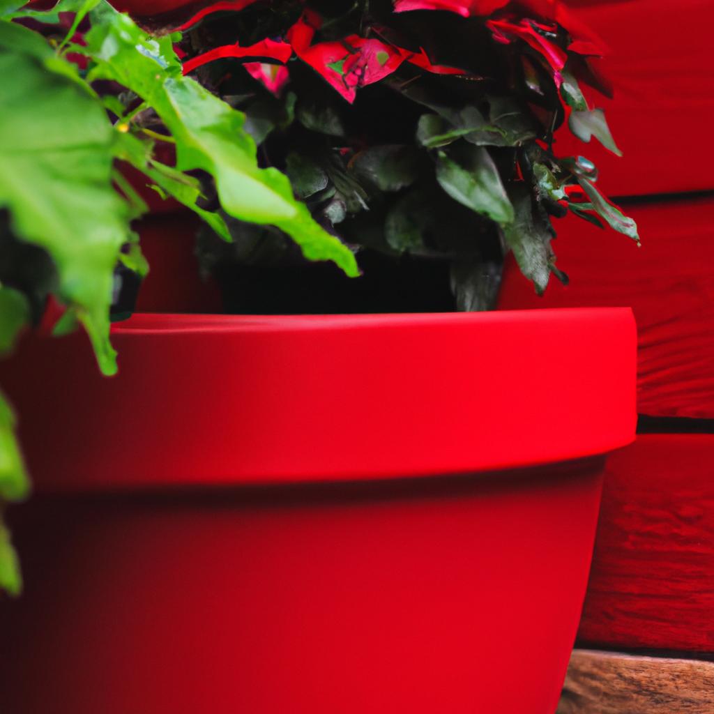
A well-known example is the use of red in interior design. Red can easily create a feeling of warmth, romance and even excitement. In a bedroom, for example, it can make the atmosphere more intimate and cozy, while in a living room, red can create an energizing atmosphere that will draw people in.
Color psychology has been used to great effect in restaurants as well. Certain colors can be used to set the mood of the restaurant, such as blues and greens to create a feeling of calm and relaxation, or oranges and yellows to create a vibrant atmosphere. Different restaurants have different needs so the selection of the colors should be tailored to suit the purpose of the space.
Colors can also be used to influence our emotions. For example, cool colors such as blue and green tend to bring out feelings of calmness and tranquility, while warm colors such as red and orange are associated with energy and enthusiasm.
Color psychology can have a profound effect on interior design, and these case studies provide a glimpse into how effective it can be. By carefully selecting and using the right colors, one can create an atmosphere that will be enjoyable and inviting.
Conclusion
In conclusion, we have discussed the importance of color psychology in interior design and how it can be used to create different atmospheres and moods. We have defined and explored color schemes in detail, explored how color psychology interacts with different interior design styles, and discussed how to successfully combine colors to create desired moods. We have also explored how to use lighting and accessories to enhance color schemes, looked at various exercises to help select colors for interior projects, discussed common mistakes when using color psychology, and seen some examples of successful case studies.
By exploring all these different topics, we can now confidently put color psychology into practice when tackling interior design projects. Keep in mind that the end result should be both aesthetically pleasing and reflect the desired atmosphere. By understanding the complexities and interactions between colors and moods, you will be able to create an interior that is both beautiful and emotionally resonates with the user.
comments: 0
